Rung 03 · Fixed scope. Guidelines included. · Six to eight weeks.
Identity & Brand System.
Identity, type and color architecture, core applications, and a written guideline document your vendors can execute against without asking you.
Talk about it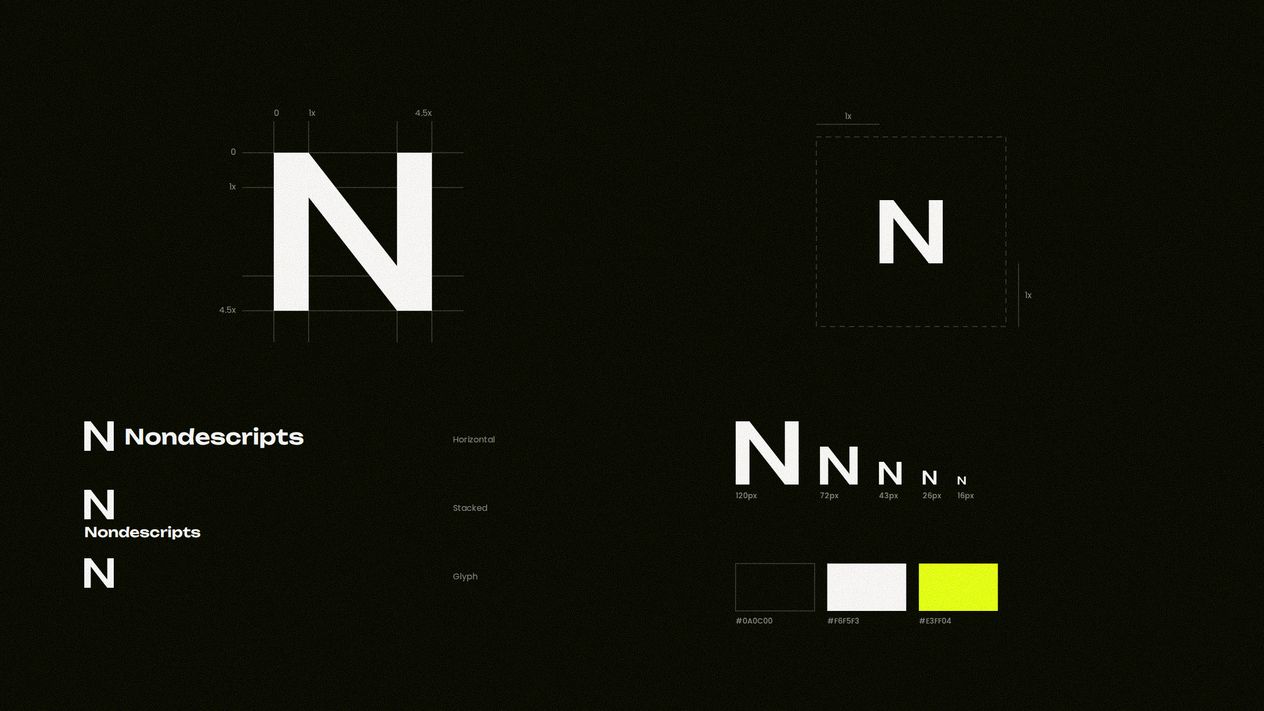
This is for you if
You are building the brand properly, for the first time or the last.
A logo is not an identity. An identity is the set of decisions that lets ten different people make a hundred different things that all look like the same company, and the document that makes those decisions survivable after the designer leaves.
What is included
Fixed scope, stated up front.
- Identity system
- The mark and its full family: sizes, clear space, the behaviors that keep it recognizable at signage scale and at favicon scale.
- Type and color architecture
- A ramp and a palette with contrast measured, not eyeballed, so accessibility is structural rather than a later retrofit.
- Core applications
- The pieces you actually use every week, designed properly once so the rest can be derived from them.
- Written guidelines
- A real document. The rule, the reason, and the failure case, because a rule without a reason gets broken the first time it is inconvenient.
- Design tokens and a Figma library
- So the system is machine-readable, not just a PDF someone has to interpret.
How it runs
Three stages. One person through all of them.
- 01
Position first
What the business is, who it is for, and what it must never look like. Wrong here means everything downstream is wrong.
- 02
Build the system
Mark, type, color and the rules that bind them, developed together, because they only work as a set.
- 03
Apply and document
Core applications built, then the guideline document written from what was actually decided.
Fixed scope. Guidelines included, not sold separately.
From this engagement
What it produced.
-
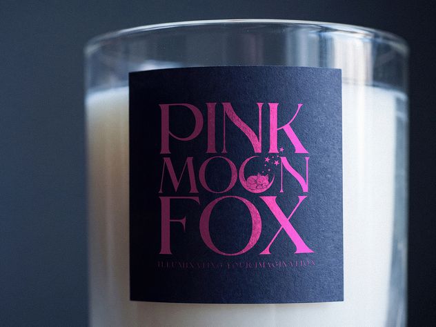
Pink Moon Fox
Branding · Design
Strategic Contrast for Luxurious Authority
This project focused on developing the visual identity and packaging for Pink Moon Fox, a premium brand blending imaginative whimsy with high-end quality.
-
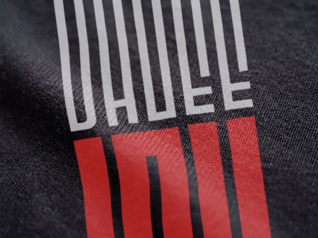
OhGee Ink
Branding · Design · Marketing · Websites
Unlocking Growth with a Unified Brand Identity
This project involved a comprehensive brand refresh for OhGee Ink, a dynamic digital and print content specialist. The goal was to replace an inconsistent, fragmented identity with a refined, scalable visual system that positioned the company as an authoritative leader in its space.
-
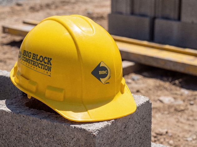
Big Block Construction
Branding · Design · Marketing · Websites
Building a Brand on Trust and Durability
This project established a foundational brand identity for Big Block Construction, a company focused on high-quality building projects.
-
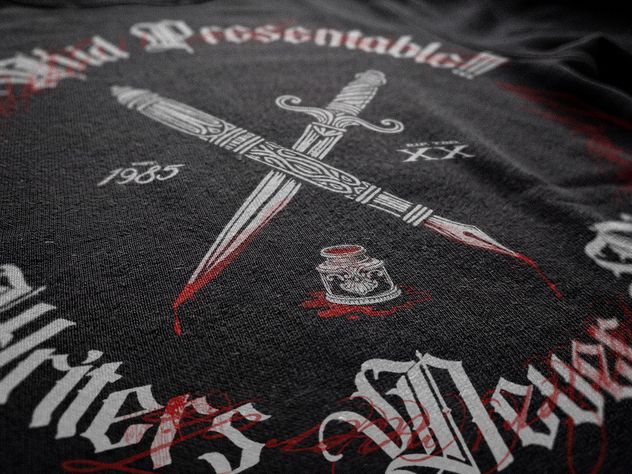
Kid Presentable!!!
Branding · Design · Web
The Client Who Keeps Coming Back
Album art, merchandise and a website for the recording artist Kid Presentable!!!, built one project at a time across several years rather than delivered as a single engagement.
-
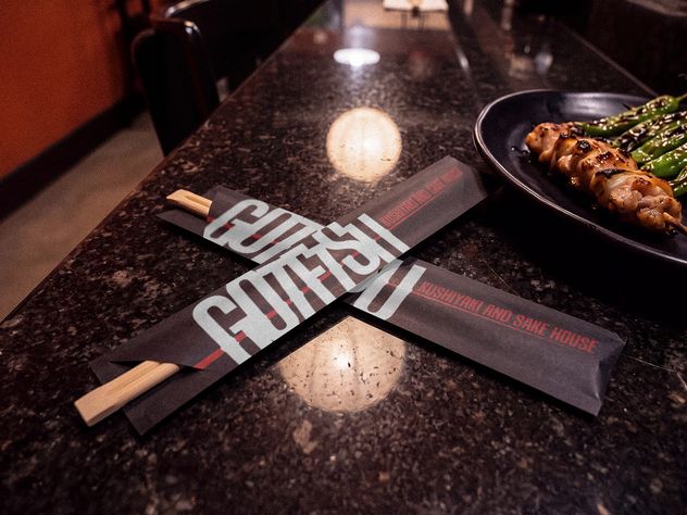
Gotetsu
Branding · Design
Crafting an Authentic and Cohesive Local Japanese Brand
This project focused on establishing a complete visual identity and branding system for Gotetsu, a local Japanese restaurant dedicated to providing a high-quality culinary experience.
The rung above
Web & Collateral.
The site and everything around it (pages, decks, print, packaging, social assets), designed and built as one system rather than as separate jobs by separate people.
See Web & Collateral