Branding · Design · Marketing · Websites
OhGee Ink.
This project involved a comprehensive brand refresh for OhGee Ink, a dynamic digital and print content specialist. The goal was to replace an inconsistent, fragmented identity with a refined, scalable visual system that positioned the company as an authoritative leader in its space.
Identity & Brand System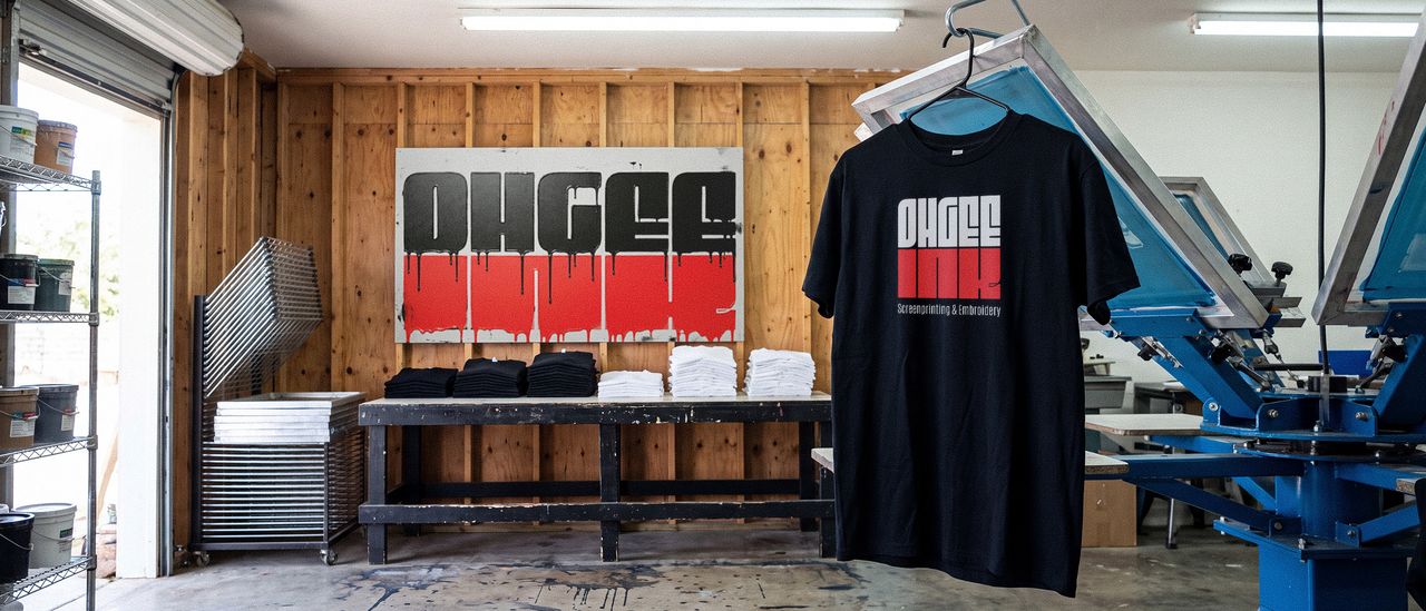
About this project
OhGee Ink prints shirts. Screenprinting and embroidery, mostly for other people’s brands, and they are good at it: tight registration, clean edges, colors that sit where they are supposed to.
Their own logo did not show any of that. There were several versions in circulation, none of them quite matching, and the mark was a piece of art rather than a demonstration. For a printing company that is a specific kind of expensive problem. Every shirt they hand out is a sample, and theirs was arguing they were average.
What I did
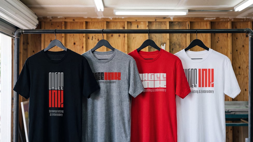
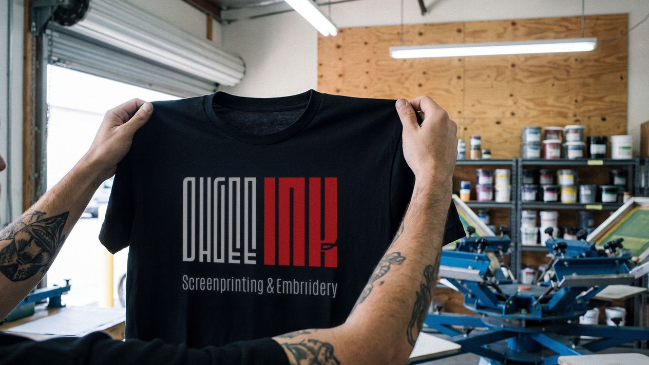
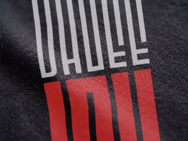
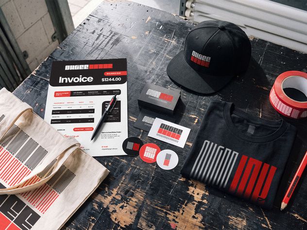
Made the mark a print test. Fine vertical strokes in gray, a solid red block beneath, and no tolerance between them. Printed badly it falls apart. Printed the way they print, the registration is the proof. The logo on their own shirt is now the strongest sample in the shop.
Cut it to one lockup. The versions in circulation were the real problem, not the drawing. One primary mark with a stated hierarchy for where the descriptor sits, which is what stops a fifth version appearing the next time someone needs a file in a hurry.
Wrote the guide. Twenty-four sections, and most of them are about language rather than artwork. The drawing rules are short because the mark is simple: clear space equal to the logo’s own height on all four sides, three colors with a Pantone match each, Montserrat sized on a golden ratio scale, stacked and horizontal lockups in two-color and one-color knockout, three pattern grids pulled out of the logo’s own shapes, and seven things nobody is allowed to do, one of which is re-set the wordmark in a font, because it is drawn rather than typed. The tagline gets its own rule: carry “Screenprinting & Embroidery” where the audience is new, drop it where it is not.
The longer half is how they talk. A named voice, the Focused Artisan, at eighty percent signal and twenty percent soul. Four tones with the situation each one belongs to, including the one for delivering a delay. And a lexicon of word swaps: partners rather than customers, a run or an edition rather than a job, apparel rather than swag. A printer gets judged on the email as much as on the shirt, and there was no agreed way to write one.
Rebuilt the site on it. The same system on the screen as on the garment, so the work they show and the way they show it stop disagreeing.
What changed
Leads, online attention and inquiries are all up since the rebrand. No figures attached to that, and a shop this size is not running attribution, so it is as precise as it honestly gets.
The change they named first was not about customers at all. For their first few years there were several logo iterations in circulation and no consistent color across platforms. Going through the mark, the type, the patterns and the rules in the guide changed what the owners think their own business is worth. That is the outcome they volunteered ahead of the leads, and it is the one I would not have thought to ask about.
Jon more than rebranded our screen printing business, he increased our own perceived brand value. For our first few years, we went through several logo iterations without sticking to one, and we lacked a consistent color scheme across our platforms. Breaking down the logo, fonts, patterns, and styles in the brand guide made us feel like our brand is much more valuable. He completely shifted our perspective on our business's worth.
The work
Shown at size.
Next
Big Block Construction.
This project established a foundational brand identity for Big Block Construction, a company focused on high-quality building projects.
See it