Branding · Design · Marketing · Websites
Big Block Construction.
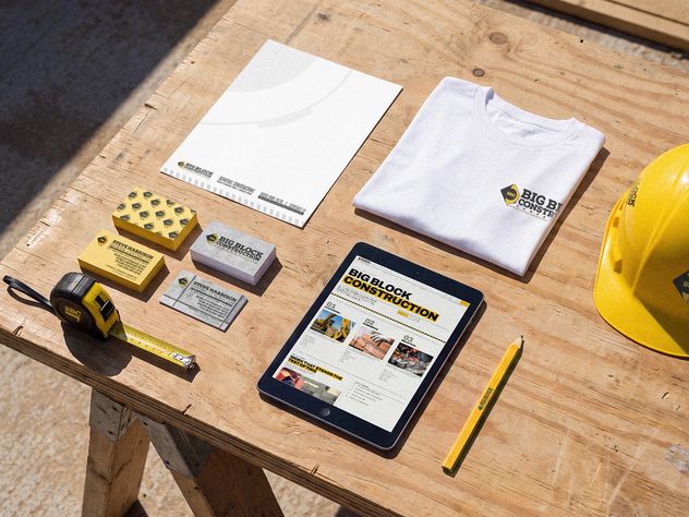
This project established a foundational brand identity for Big Block Construction, a company focused on high-quality building projects.
Identity & Brand System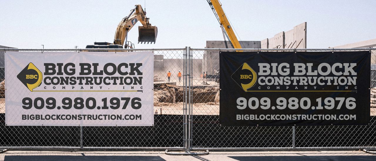
About this project
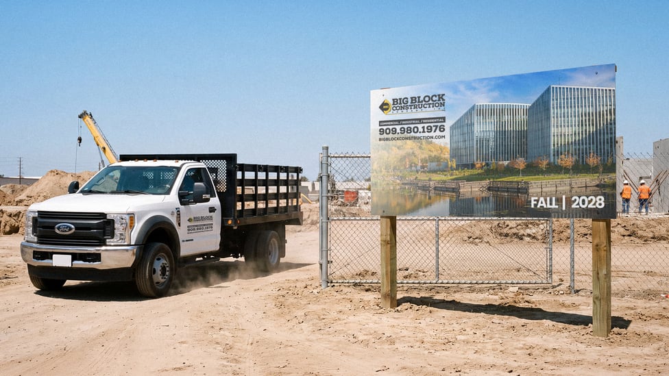
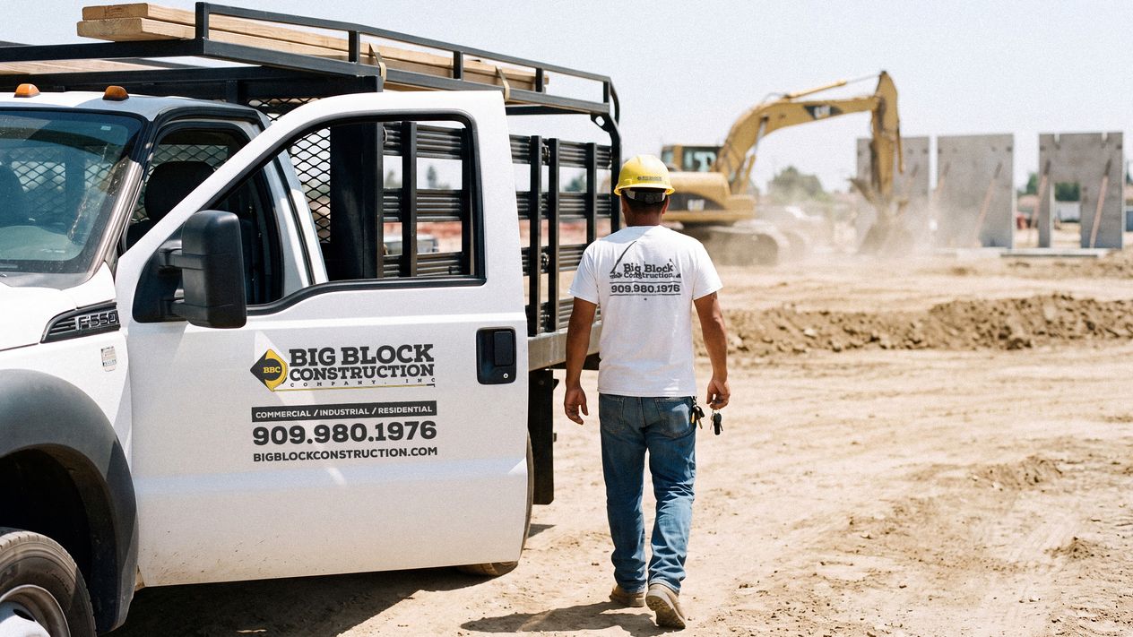
Big Block Construction’s identity had to survive being read at sixty miles an hour off a truck door and at two hundred feet off a fence. Almost nothing else about it mattered.
What they had was close. An abstract tape measure, and a piece of play between the letterforms that the owner liked and did not want to lose. It worked on a business card. It disappeared on a job site, which is where the brand actually lives.
What I did
Made the tape measure the mark. It was already the idea; it was not yet the icon. Pulled out and set in a diamond, it anchors everything in measurement and precision, and it holds at a size where a wordmark would turn to mud.
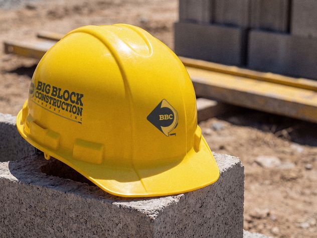
Separated the two registers instead of merging them. The authoritative lockup runs on proposals, signage, vehicles and safety gear. The playful letterforms moved to apparel, where personality costs nothing. One brand, two rooms, and the formal one never has to apologize.
Designed for the worst viewing conditions first. Blocky, high contrast, yellow and black, tested at the distances the work is actually seen from rather than at the size it is drawn at.
The site, and what it is actually for
The offer was always the full thing: as many pages as they wanted, as complicated as they wanted. It stayed open for years and they never took it, and the reason was not time or budget. They did not need it.
Big Block does not win work from search. A prospective customer arrives already half decided, having seen the trucks, or the signs on a fence, or been given a name by someone they trust. What the site has to do is confirm what that person already suspects: that these are jobs of a certain size, that there are a lot of them, and that the company behind them has been doing this long enough to be handed another one.
One page does that. Photographs that carry scale and breadth, the information a person actually checks, and nothing standing between them and the phone number. More pictures can go in later if Steve wants them, and the shape of the page allows for it.
The lesson is not that smaller is better. It is that a website has one job, and nobody had said out loud what Big Block’s was.
Jon has been taking care of our website for so many years and we never have to tell him that something needs to be fixed or updated, he's very proactive and on top of it. If I ever were to ask for changes, he's on it immediately. I remember when we had the blue logo way back in the day and I was hesitant to change it, but I love the one he recreated with the tape measure.
The work
Shown at size.
Next
Kid Presentable!!!
Album art, merchandise and a website for the recording artist Kid Presentable!!!, built one project at a time across several years rather than delivered as a single engagement.
See it