Branding · Design · Web
Kid Presentable!!!
Album art, merchandise and a website for the recording artist Kid Presentable!!!, built one project at a time across several years rather than delivered as a single engagement.
Identity & Brand System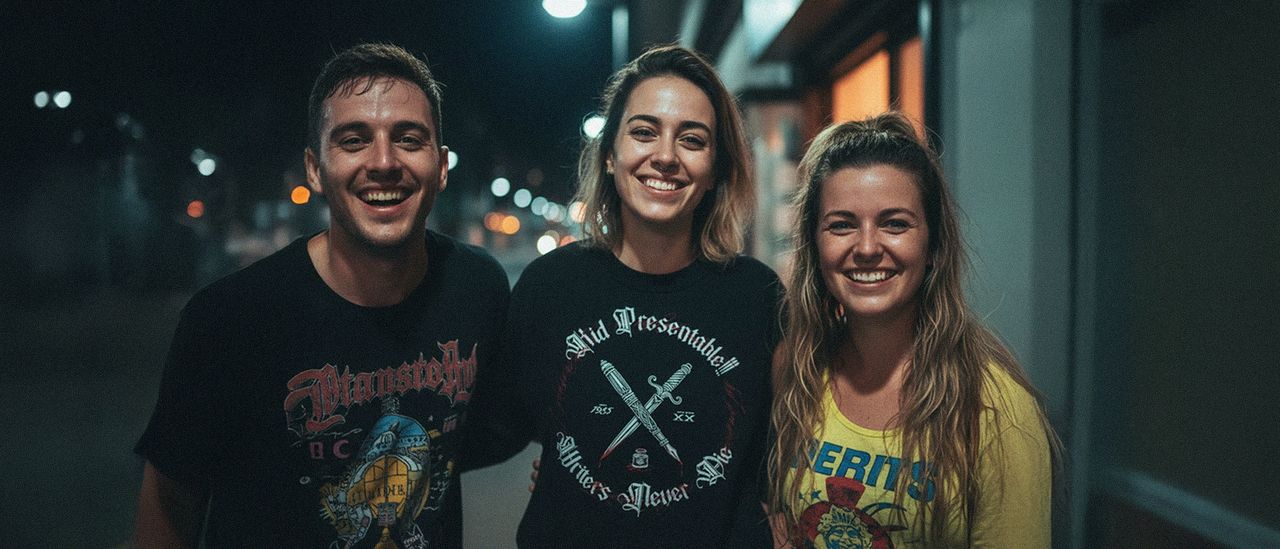
About this project
Kid Presentable!!! is a recording artist whose work sits between contemporary hip hop and the visual language of punk and hardcore. The relationship has run for over a decade, across album art, merchandise, stickers and most recently a website. No brief has ever covered more than one piece at a time.
The problem
Independent artists do not commission identities. They commission the thing that is due: a cover for the record coming out, a shirt for the tour, stickers for the merch table. Each request arrives on its own, with its own deadline, and usually with no reference to what came before.
That is the real problem, and it is not confined to music. Work commissioned this way drifts. Six covers made by four designers over five years look like six covers made by four designers, and the artist ends up with a catalog that reads as unrelated releases rather than a body of work.
The constraint was to hold a recognizable through line across years of unconnected briefs, without the authority a formal brand system would have given, and without ever slowing down a release.
What I did
There was no style guide to enforce, so the continuity had to live somewhere else.
-
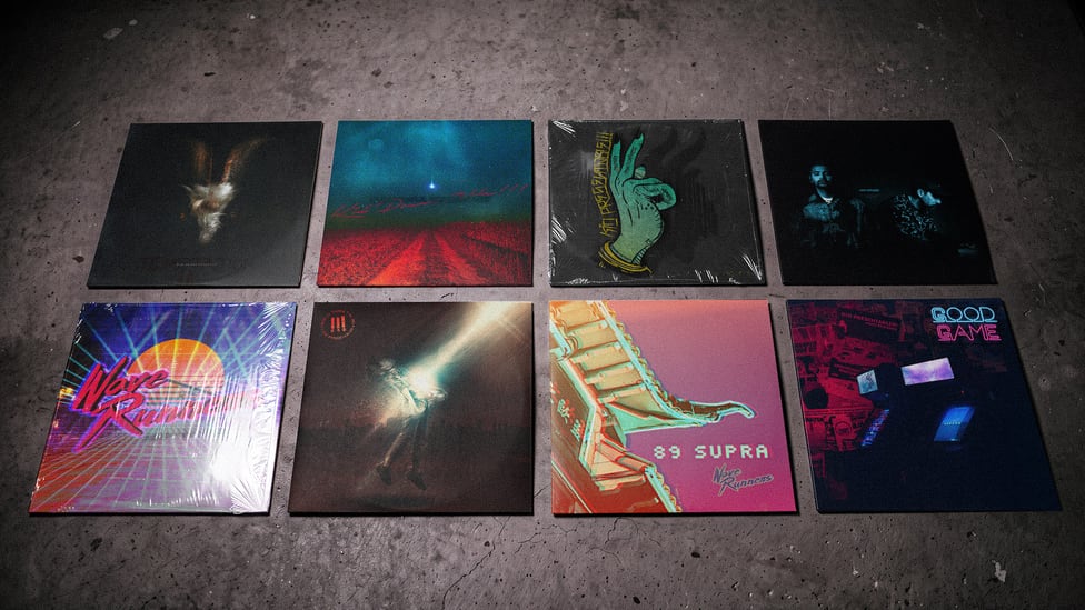
Album art across more than ten releases. Entre La Tierra Y El Sol, Writers Never Die, Excellence of Execution, Good Game and Vices among them. Each answers its own record, and the range between them is wide on purpose: the material moves between lyrical and aggressive, and covers that all looked alike would have flattened that.
-
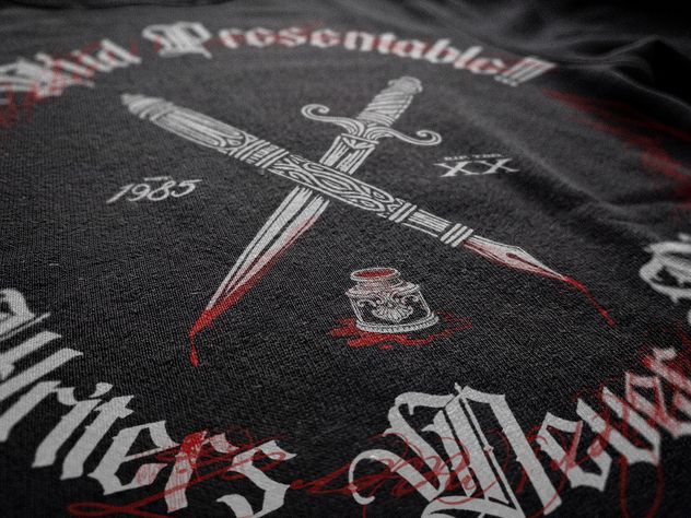
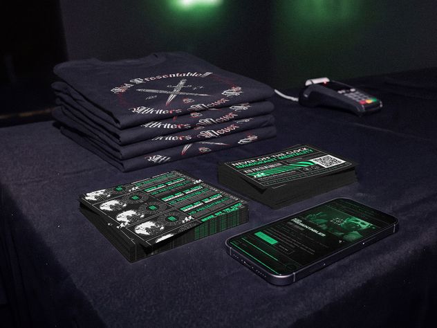
Merchandise. The “In times of war at the top” shirt, built around a crossed dagger and pen in a Gothic blackletter treatment. A single high-contrast graphic that had to work at conversational distance on a body, not on a screen.
-
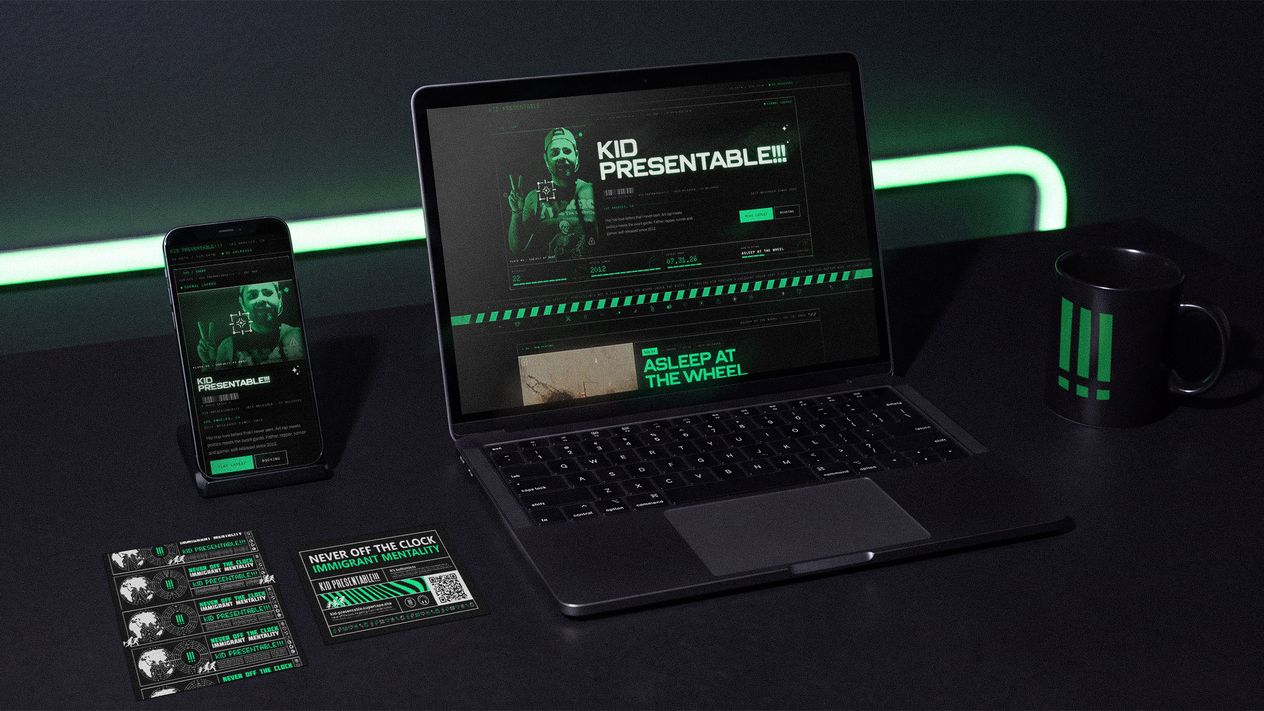
Stickers and short-run collateral. Physical pieces he can hand out for free. The theme is immigrant mentality: he is Salvadoran, and with immigration where it currently sits politically, he wanted a way to say something about that through the work rather than separately from it.
- The website at kidpresentableraps.com. A site showcasing his music. The first piece of work with a job beyond a single release: a permanent address the catalog can live at.
What holds it together is not a repeated mark or a fixed palette. It is one person carrying the context forward: knowing what the last cover did, what the artist rejected two years ago, and where the line sits between authentic and cliché in a genre that punishes getting that wrong.
What changed
What a Long Relationship Buys
-
The catalog reads as one artist. Across twenty-plus pieces and more than a decade, the work is varied without being incoherent. Someone finding the newest release and working backwards sees a body of work, not a pile of jobs.
-
Every brief starts further along. No onboarding, no re-explaining the audience, no first round spent discovering what the artist will not accept. That compression is most of the value, and it exists only because the relationship was allowed to continue.
-
The work grew with the artist. It began with single graphics and now includes the website, scope earned across years rather than negotiated up front.
Why This Case Is Here
This is the closest thing on this site to how fractional work actually behaves. Not a project with a start and an end, but a standing relationship where the person doing the work already holds the context, so each new thing costs less, lands faster, and fits what came before without anyone having to write down why.
The client is an independent artist rather than a scaling company. The mechanism is identical.
I have been working with Jon in some capacity for at least 15 years. Before that I was struggling with creative direction, making sure my projects were cohesive and had a clear narrative line throughout. That is no longer a problem. Whether it is album art, a website, signage, or a back-end fix, my projects are consistent and the response is prompt and effective. I still work with him closely today.
The work
Shown at size.
Next
Gotetsu.
This project focused on establishing a complete visual identity and branding system for Gotetsu, a local Japanese restaurant dedicated to providing a high-quality culinary experience.
See it