Branding · Design
Pink Moon Fox.
This project focused on developing the visual identity and packaging for Pink Moon Fox, a premium brand blending imaginative whimsy with high-end quality.
Identity & Brand System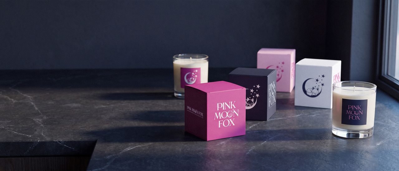
About this project
Pink Moon Fox sells candles at a premium price with a cartoon fox asleep on a crescent moon as its mark. Those two facts pull against each other. The illustration is the reason anyone remembers the brand, and it is also the reason a shopper can decide, in the second before picking the box up, that this belongs in a child’s room rather than on a nightstand.
The job was to keep the fox and lose the doubt.
What I did
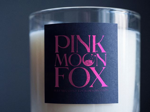
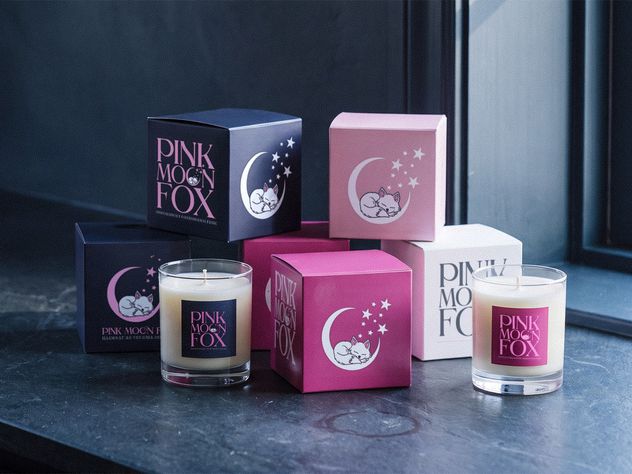
Split the mark in two and gave each half one job. The fox carries the feeling. The wordmark, all caps, high contrast and widely spaced, carries the price. Neither is asked to do both, which is what breaks most brands built on an illustration.
Picked a palette that changes register. Midnight navy and a saturated pink. On navy the same fox reads as evening; on pink it reads as warmth. One palette, two moods, nothing redrawn between them.
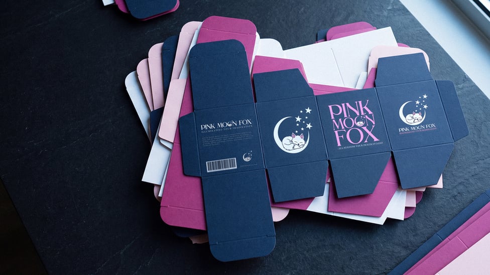
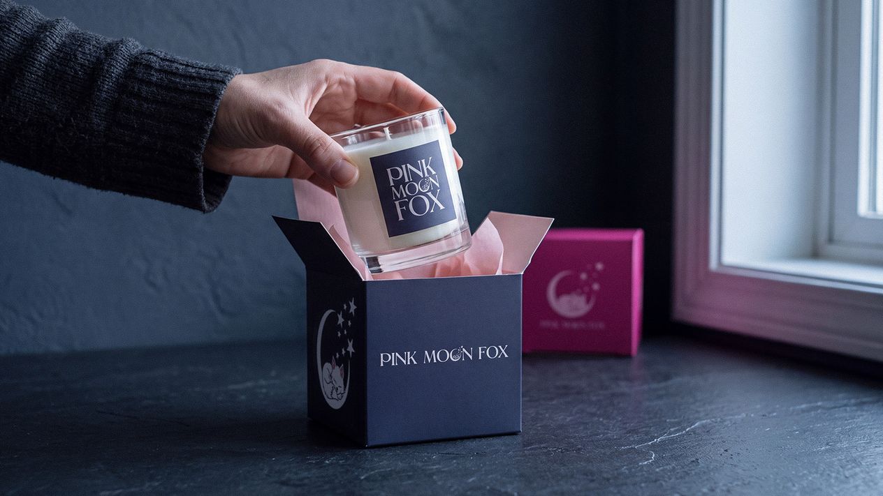
Made the box part of the product. One structure, four colorways, so a shelf of them reads as a range rather than as four unrelated candles, and the unboxing does work a paid photograph would otherwise have to. The colorway is in the board rather than printed onto white, so the cut edge and the inside of the lid match the face, and the mark sits on top of it in opaque white and pink. Matte throughout, no foil and no gloss.
Drew it as flat blanks first. A package is a die line before it is an object, and that is the only stage where you can find out it does not work without paying for a print run to tell you.
What changed
Before this the outward-facing brand was assembled from whatever was nearest: stock graphics, a different font on each platform, nothing that carried from the website to the packaging to a table at an event. That is not a design failure. It is the ordinary result of a small company making each piece at the moment it was needed.
Now there is one set of decisions they apply themselves. Mark, palette, type, and a box that carries all three. A company this size has nobody whose job is keeping a brand consistent, so the work had to hold without one.
Working with Jon on the Pink Moon Fox brand guide and graphics was a complete game changer for us. He helped us take what we had and turn it into a cohesive, recognizable brand that carries across everything from our candle packaging and merch to our pop-up displays and online presence. Now when we show up to an event, everything actually feels like Pink Moon Fox, and it has made a huge difference in how professional and put-together the brand feels.
The work
Shown at size.
Next
OhGee Ink.
This project involved a comprehensive brand refresh for OhGee Ink, a dynamic digital and print content specialist. The goal was to replace an inconsistent, fragmented identity with a refined, scalable visual system that positioned the company as an authoritative leader in its space.
See it