Built here · Live · Product · Branding · Design · Systems · Web
Will You Bury Me.
Plain-language end-of-life logistics. Answer about forty questions, name one person, hand them a document they have agreed to hold.
Visit website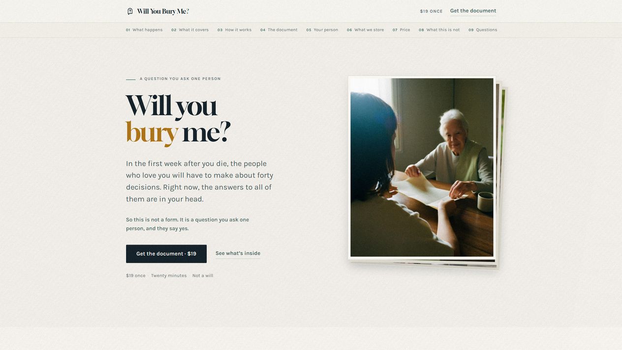
About this build
Where the name came from
The domain came from our wedding. Will you bury me is etched inside my ring.
It started as the better version of the question. Will you marry me gets a yes at a party. This one asks about the part nobody puts on an invitation, and it is the one that actually costs something. We have been married for years now, and the domain sat doing nothing for most of them.
What changed is that our parents got older. Those conversations start arriving on their own, and they stall in the same place every time. Nobody wants to be the one who brought it up, and nobody has written anything down.
So the name is a proposal, will you marry me crossed with till death do us part, and the whole product follows from it.
What it is
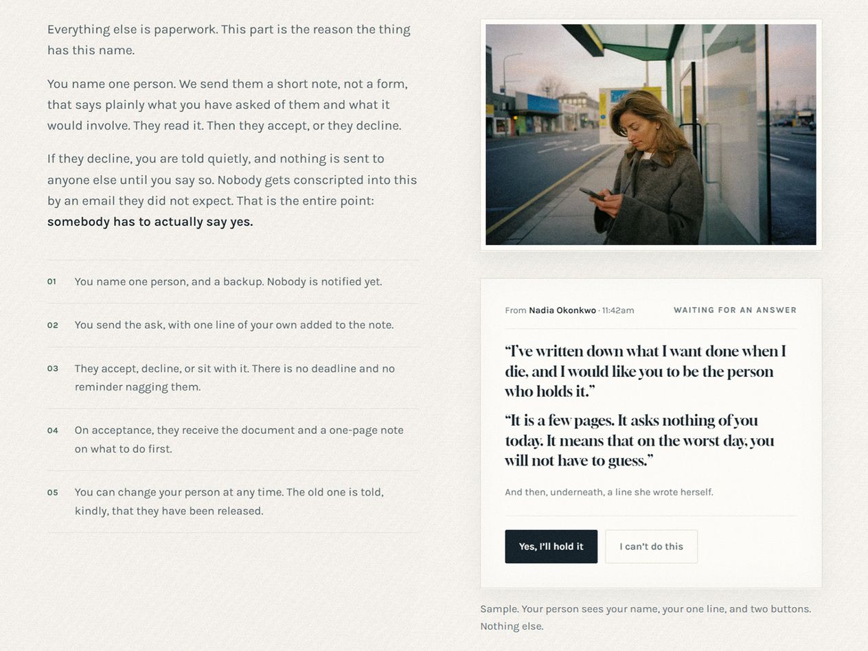
It is a form. About forty questions, and you sit down and fill them in like any other form. What the name changes is what the form is for: at the end of it you name one person, and that person has to say yes. The answers are the easy part. Somebody agreeing to hold them is the product.
Which is why the document reads closer to a vow than a worksheet.
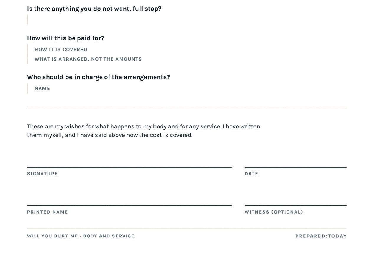
About forty questions across six sections, in plain language, skip anything you want. Who gets called, and in what order. Where the will and the deed and the spare key actually are. Who takes the dog. What you want and what you do not. Then you name one person, they accept, and you both print a copy.
Nineteen dollars, once. Twenty-nine with a foil card to hand over.
Why this one exists
Everybody dies and almost nobody writes any of this down, because the existing options are a will, which costs money and moves property, or a shoebox. The gap in the middle is where the actual pain is: a family in the worst week of their lives making about forty decisions with no idea what the person wanted.
It was also a chance to build something where the design decisions are load bearing rather than decorative. A product about death can go two ways, morbid or greeting card, and both are unusable. The type, the palette and the photography are all aimed at a third thing: serious, warm, and not frightened of the subject.
What was hard
Getting the tone right, which took the name to solve. Early versions read like estate planning software. The name unlocked it. Once the form is understood as a proposal, every copy decision has an answer: you do not say “designate a beneficiary,” you say “name your person.”
The card almost went to the wrong address. The natural design is to mail the ask to the person being asked. That is wrong three ways. It collects a third party’s home address, which contradicts everything else the product promises. It drops “will you bury me?” cold into somebody’s mailbox, which is the one way this product could genuinely hurt a person. And it takes the ritual away from the buyer, who should be the one handing it over. The card goes to the buyer. The card is the ask and the site is the yes.
The accessibility pass failed the brand, and the brand lost. The amber the whole identity hangs on measures 1.96:1 against the paper ground, which fails even as large text. Rather than keep it and look the other way, the marked word uses a deepened tint on light grounds and the real amber only where it passes. Sage had the same problem at small sizes and got the same treatment. Every page is now clean at 390 and 1280 pixels, verified with a real checker rather than by eye.
Two lessons that cost a day each. A week-long stylesheet cache served a phone that had visited before an old CSS file, so new image rules never arrived and the hero blew the layout out. The fix is a cache-busted stylesheet and testing on a phone with history rather than a fresh browser. Separately, the first product email went straight to Gmail’s spam folder, because mail sent from a web host with no authentication set up is indistinguishable from forgery. Email now goes through a proper sending service. Both are the kind of thing you would rather learn here than on a client’s launch day.
What it is not
Not a will. It does not move property, name an executor, or override anything. It is a letter of instruction, which is the thing that sits alongside a will and answers the questions a will was never meant to.
What it is good for is the step before one. Going to an attorney cold means paying by the hour to work out what you think while you sit there. Filling this in first means arriving with the answers already made and a printed copy to hand across the desk. It also works for people nowhere near needing a will who just like being ready, which is most people who have thought about this for ten seconds and then closed the tab.
What it demonstrates
No client, so the receipts have to be the work.
- The research changed the product, not just the copy
- The obvious version of this product holds your passwords. Reading the law says don't. Most states have adopted a statute that puts the tools the platforms themselves provide, Google's Inactive Account Manager, Apple's Legacy Contact, Facebook's Legacy Contact, above instructions left in a will. So the most valuable thing the product can do is walk someone through setting those up in ten minutes. That is free, it outranks anything this product could write, and it means never holding a credential. The research deleted a feature and made the thing better.
- One accent, and it is actually enforced
- Amber appears in exactly two places on the entire site: the marked word in the headline, and the chip that says a person accepted. It is not allowed to fill the primary button, because a color that means everything means nothing. A third amber moment is treated as a bug rather than a preference. That is what a brand rule is for, and it only counts if something you wanted to do gets refused by it.
- Privacy as a build decision, not a policy page
- No accounts and no passwords. Answers are encrypted at rest, the buyer's private link is the key, and there is a one-and-done option that generates the document and erases everything thirty days later. The line that governs all of it is on the homepage: we record where the key is, never the key. A promise you can only keep by changing the schema is a different kind of promise from one you make in a privacy policy.
- It transacts, all the way through
- Checkout, a private link emailed on purchase, an autosaving questionnaire across six sections, an ask that the named person accepts or declines with the buyer told either way, a yearly reminder on a date you pick, export, erase, and a printable document with a signature page. One person built every part of that, which is the argument the rest of this site makes in the abstract.
Up close
The parts worth looking at.
The obvious question
Why does a brand practice build its own products?
Because the alternative is learning this on your deadline. Every decision on this page, and every trap written down in it, came out of a project where the only person exposed was me. Client work is where that gets applied, not where it gets discovered. It is also the honest answer to whether one person can carry something from the first sketch to a thing running in production, which is easier to show than to claim.
Also built here
Fourword Thinking.
A daily game. Describe the prompt in exactly four words, then vote on the best ones.
See Fourword Thinking