Branding · Design · Marketing · Websites · Partnership · Social
655 Rehearsal Studios.
655 is a rehearsal studio in Upland, California, co-owned by four partners. I am one of them, and the brand, the website, the social and the systems behind them are my side of it. This is what the work looks like when I am also one of the people paying for it.
Partnership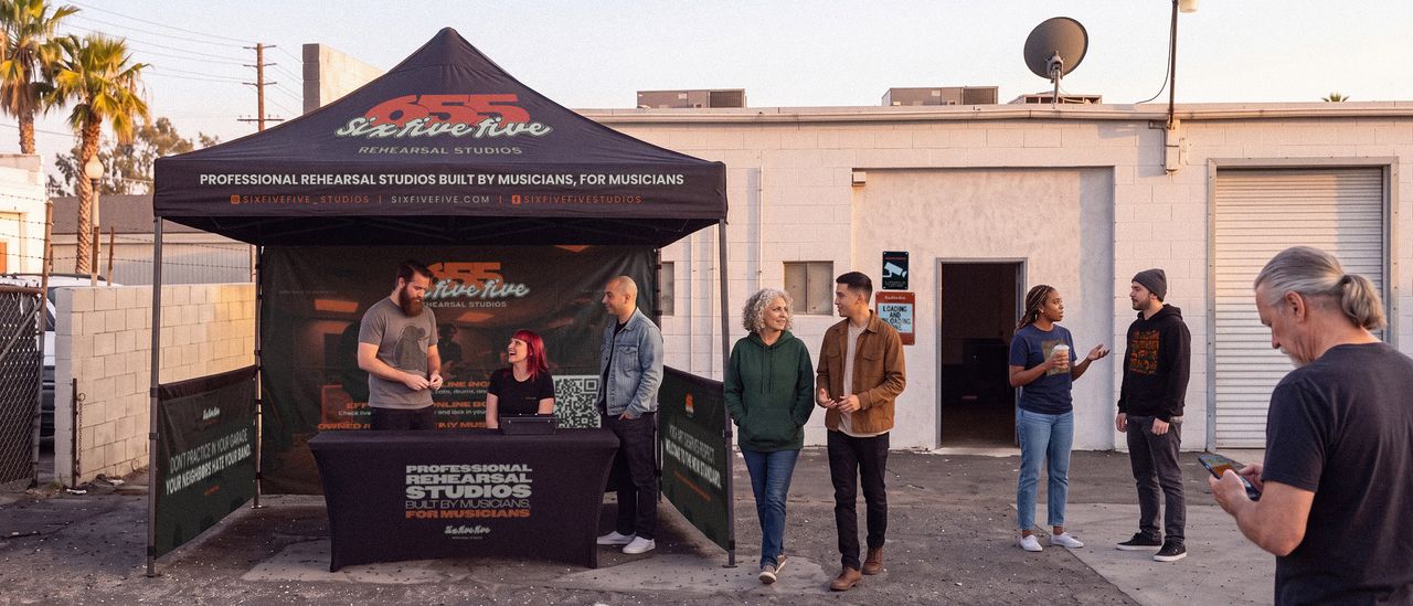
About this project
Disclosure first, because it is the point: 655 is partly mine. Four of us opened it in Upland in 2026. My partners run the business. My side is the brand: the name, the mark, the palette, the typography, the two voices it speaks in, the booking site, the signage, the photography, the social, and the systems that keep all of it consistent.
That makes this the least impressive case study on the site and the most useful one. Everywhere else you are looking at work a client approved. Here you are looking at what I do when I am one of the people paying for it, and when the people who have to live with it every day are my partners rather than a client I can hand a PDF to and walk away from.
The problem
Rehearsal studios are usually one of two things. At one end, expensive lockouts rented by the month to bands who can afford a room sitting empty six days a week. At the other, hourly basements with broken gear, bad acoustics and a landlord who does not answer the phone. Almost none of them are branded at all, because the category has never had to compete on anything except being the closest one with a free slot.
That is an opening and a trap at the same time. The opening is that a studio which looks and sounds like it was built on purpose stands out immediately. The trap is that musicians can smell a marketing department from the parking lot. Polish reads as a chain. Anything that sounds like a co-working space or a storage unit ad loses the room before the first session.
So the problem was not “make it look good.” It was to build something that reads as professional to a band deciding where to spend three hours on a Tuesday, without reading as corporate to that same band.
What I did
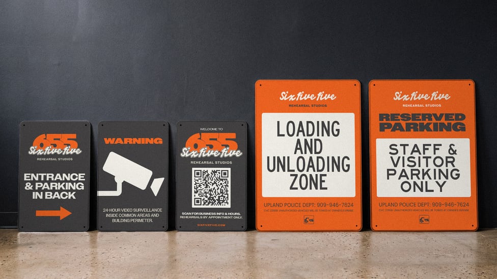
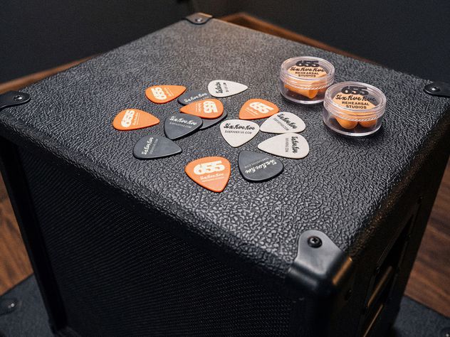
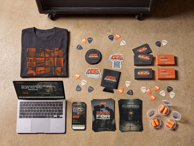
The visual system is deliberately narrow so it can be applied fast and consistently by one person: a near-black charcoal, a warm greige, an off-white, and a single loud orange that does all the work. Owners for headlines, Poppins for everything else. Dark, industrial, one accent. It holds on a sign, a phone screen, an Instagram post and a rate card without being redrawn each time.
The part that took longer was deciding the studio speaks in two registers rather than one, and writing down when to use which.
-
The operational voice runs the site, the FAQ, the booking policy and the signage. Blunt, stern, no apology. “The clock runs on time.” “There are no grace periods.” It sounds like a venue manager, not a legal disclaimer, because a rehearsal studio that is vague about its rules is a rehearsal studio that runs late all day.
-
The social voice runs Instagram and most of the advertising. Same grit, warmer, closer to a manifesto. “I am a musician because I have to be.” “We encourage loud.”
Most small businesses collapse those into one voice and end up sounding apologetic about their own rules or corporate about their own passion. Two registers, with a written rule for which goes where, is what keeps a brand consistent when the person writing the caption is tired and it is Sunday night.
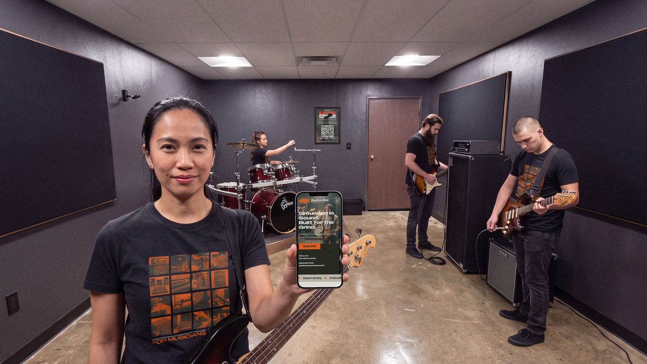
The same discipline runs through the rest of it. Real pricing, published: Studio A at $25/hr, Studio B at $30/hr, a two hour minimum, no quote required. The gear brands stay visible in the photography instead of being retouched out, because on-site Pork Pie, Ampeg, Marshall and Orange do more for credibility than any adjective would.
What changed
What Owning It Proves
-
The system holds in hands that are not mine. My partners run the rooms, answer the questions and post when I am not around, and none of them are designers. A brand that only stays consistent while a designer supervises it is not a brand, it is a mood board. This one has been holding without supervision since the doors opened, which is the whole test.
-
The voice rules are load-bearing, not decoration. Writing down which register goes where is the difference between a consistent brand and one that drifts inside a month. It is the single most portable thing on this page, and it is the piece most studios skip.
-
Customers praise the things the brand promised. 5.0 stars across six Google reviews, and what people mention unprompted is climate control, working backline and sound treatment. The positioning said the category’s problem was friction and neglect. The reviews came back about air conditioning and gear that works.
-
It is the partnership offer running for real. Everything on the Partnership page describes standing capacity across identity, web, print, photography and social, held by one person who already knows the business. At 655 that person is me, for a business with three other owners who needed a design department and were never going to hire one. It is the arrangement working in the open rather than described in the abstract.
Having Nondescripts handle our branding from day one changed how we saw our own business. The signage, socials, and merch were all dialed in before we even opened our doors, and every piece felt meticulously curated. It's the kind of work that makes you realize you don't just have a good product, you have a competitive edge.
The work
Shown at size.
Next
Pink Moon Fox.
This project focused on developing the visual identity and packaging for Pink Moon Fox, a premium brand blending imaginative whimsy with high-end quality.
See it