Ohgee Ink: Unlocking Growth with a Unified Brand Identity
This project involved a comprehensive brand refresh for OhGee Ink, a dynamic digital and print content specialist. The goal was to replace an inconsistent, fragmented identity with a refined, scalable visual system that positioned the company as an authoritative leader in its space.
To fully appreciate the scope of the rebrand, it is essential to understand the challenges presented by the previous visual identity.
Challenge & Solution
The Challenge: Visual Fragmentation
Ohgeeink's existing visual identity, while aesthetically passable, suffered from a critical strategic flaw: inconsistency across platforms and a failure to showcase the company's versatility and print quality. The original logos did not act as a "walking billboard" of their technical expertise, creating a mismatch between the high quality of their finished products and the external perception of their brand. This fragmentation hindered their ability to attract premium clients. I needed to create a clear, scalable mark that instantly communicated Ohgeeink's mastery and technical range within the screenprinting and content creation craft.
Previous OhGee Ink Logo Designs shown
The Solution: Professional Simplification
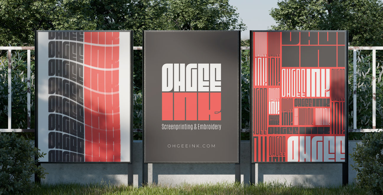
The strategy focused on achieving clarity through strategic simplification and technical excellence. I designed a new primary logo that is clean, precise, and built on a modern custom typeface, ensuring optimal scalability and performance across both digital and physical print applications. I also established a comprehensive Brand Style Guide to ensure absolute consistency. This unified system guarantees the brand’s credibility and ensures every piece of their creative output whether on a screen or a shirt serves as a clear, high-quality visual demonstration of their printing abilities.
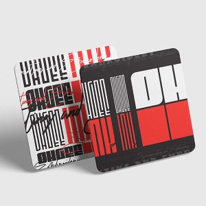
OhGee Ink Updated Logo & Brand Identity shown
Final Result & Impact
A Cohesive, Contemporary Digital Presence
The final result is a bold, cohesive, and adaptable identity. The brand is now fully equipped to thrive across all key digital and print touchpoints:
• Core Assets: A durable, scalable logo and a comprehensive brand guide for total uniformity.
• Website: A complete website redesign that uses the new visual standards to improve user experience and clearly articulate the company's value proposition.
• Market Impact: The updated identity successfully elevates OhGee Ink's positioning, transforming it into a clear, authoritative leader ready to engage premium clients and accelerate growth.